Hover Image
Construct gorgeous hover effects for your images with this stack’s enormous selection of effects and overlays.
- Choose from a vast array of different hover effects
- Opt to have a header included with your caption
- Style the caption content's background and text (varies from effect to effect)
- Choose between using a drag-and-drop image or a remote image
- Choose a separate animation style for your revealed caption
- Set a delay before the caption content is animated in
- Choose to add a link to your image
Example
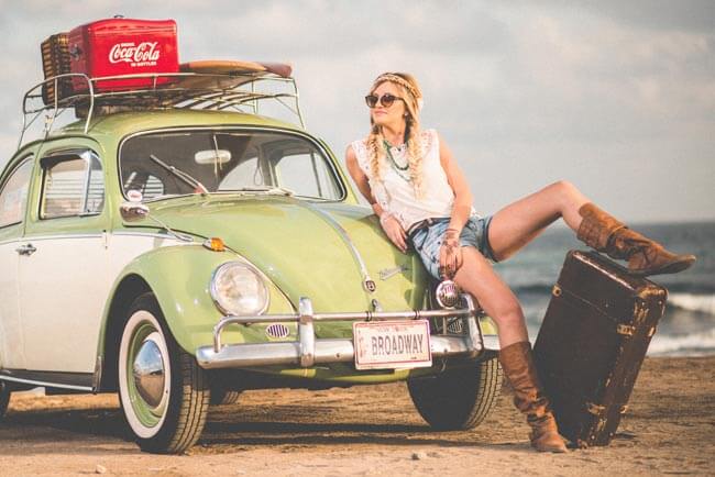
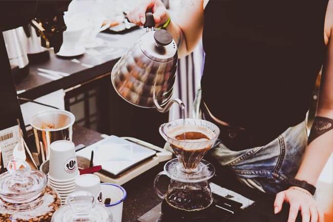
In this example we’ve placed several different Hover Image stacks within the Grid stack to allow you to see several different hover styles. These are just a very few of the many effects available in the Hover image stack. We’ve include more examples on the live Potion Pack preview page as well.

Header
Lorem ipsum dolor sit amet, sapien platea morbi aliquet.
Header
Lorem ipsum dolor sit amet, sapien platea morbi aliquet.

Header
Lorem ipsum dolor sit amet, sapien platea morbi aliquet.

Header
Lorem ipsum dolor sit amet, sapien platea morbi aliquet.
Header
Lorem ipsum dolor sit amet, sapien platea morbi aliquet.

Header
Lorem ipsum dolor sit amet, sapien platea morbi aliquet.
Using Hover Image
General
Image Type
Allows you to choose between using a drag-and-drop image or a remote based image for your hover image. When you choose which type you'd like to use you'll be given the appropriate controls for adding your image — a drop zone image well or a link picker for your remote image.
Style
Choose from three different image styles: Standard, Rounded, Circular.
Alignment
Allows you to align your image to the left, center or right.
Effect
Choose from over 100 different hover animation effects to stylize your image.
Content
Header
Choose whether you would like to include a header with your image’s caption. The header, and caption, are shown when the visitor hovers over the image.
Caption
Enter your caption here, which will be seen when the image is hovered over.
Alignment
Allows you to align the content within your content area (includes the Header and Caption) to the left, center or right.
Content Effect
Apply one of a dozen different animation effect settings to your content (the caption and optional header). This animation happens as the main animation effect is applied.
Delay
Choose to add a brief delay between when the main hover animation effect happens and when the Content Effect occurs. Altering the delay can produce different styles of effects.
Content Colors
Set your content sections background and text colors to match your site style.
Center Content Vertically
Allows you to vertically center the content within the image overlay.
Indicator Icon
Indicator Icon
When enabled this feature adds an icon on top of your image to indicate that the visitor can interact with this image by hovering over it.
Icon
Allows you to choose from a variety of different Font Awesome based icons for your indicator.
Icon Size
Allows you to adjust the size of the icon.
Indicator Color
Adjust the color of both the background and icon.
Width & Height
Provides you the ability to adjust the size of the indicator.
Alignment
You can choose to place the indicator in various locations on top of your image, aligning it to the left, right or center horizontally, as well as the top, middle or bottom vertically.
Round Corners
Allows you to set border radius for the corners of your indicator icon. You can set all corners uniformly or adjust them on a corner-by-corner basis.
Link
Include Link
Opt to include a link on your image. When enabled you can choose to link to either an internal page or an external web address.
Advanced
Alt. Tag.
Provides you a way to add an Alt. Tag to your image. The alt tag is used in HTML to specify alternative text that is rendered when the element to which it is applied cannot be displayed. It is also used by "screen reader" software so that a person who is listening to the content of a webpage (for instance, a person who is blind) can interact with this element.
Image Sizing
This feature allows you to choose how Foundry displays your image when it comes to responsive sizing. You can choose to have the image display normally, as-is and only scale downwards when the image would otherwise begin to overflow the bounds of its parent container or you can choose one of the following:
- Normal: Image is loaded as-is and is not scaled upwards in any way. It will scale down though to make sure it fits within the bounds of its parent stack(s).
- Upscale to 100%: Forces the image to scale itself past its original size, enlarging itself to fill out the entire width of its parent container.
- Max-Width: Set a maximum width for your image. The image will never scale up beyond this value but will still responsively scale downwards to ensure it fits within the bound of its parent container.
Less is more
While the Hover Image stack creates some beautiful, interactive thumbnails for your page, don't overdo it. Too many Hover Image stacks can be overwhelming for your visitors.

