Blog Entries
Stack settings
The Blog Entries stack's job is to render your Summary, Categories, Full Post and Search results views for your site's visitors as they're viewing your blog.
After the main Alloy stack the Blog Entries stack is the next most important stack when it comes to Blog Posts. This stack takes all of the main stacks data and processes it into the beautiful blog entries you see on your Summaries, Categories, Full Post views and Search results, creating what is essentially the bulk of your blog.
General
The Blog Entries stack contains a lot of different controls for customizing various aspect of your blog's design and layout. We've tried to break them up into logical groupings based on whether they affect the Summaries, Categories, Full Posts view, etc. Sometimes there is crossover between these different sections within the settings, so we've broken out some of the settings into their own groups as well.
Summaries
RELATED
LAYOUT v3
This setting allows you to choose from several different layouts for your Summaries view. When choosing your layout you'll see an icon in Edit Mode that shows an example of the currently selected layout design. These icons can be seen below. We also offer up a suggested number of Post Per Page to help you with your design decisions.






As of Alloy v3 there are five unique layouts for Summary view.
SMART FLATTEN TOPPER FOR LAYOUT v3
When building blog posts that have borders, drop shadows, etc that make the posts look like they're boxed in on the Summaries view we sometimes want one side of the Topper Image to be flattened. Alloy can do this smartly for us depending on the layout chosen by enabling this feature.
POSTS PER PAGE
Allows you to set the maximum number of blog posts to display per page on the Summaries view.
SPACE BETWEEN
You can use this setting to adjust ti spacing between your blog posts. You can adjust this setting for the Mobile, Tablet and Desktop breakpoints so that your posts can be spaced differently at each breakpoint.
POST TITLE TAG
This setting lets you customize the HTML tag that is used for your blog post's titles on the Summaries view. The default has Alloy using and H2 tag for your blog post title on the Summaries view.
TITLE FONT SIZE
Allows you to set a font size for your blog entry's title at each of the three breakpoints.
TITLE FONT
Customize the look at feel of your blog post titles for the Summaries view by choosing your font. You can use the main Foundry Control Center's Base Font or choose to use one of the Typeface presets from Foundry's Typeface stack.
FONT WEIGHT
Adjusts the boldness of your blog entry's title. When using the Foundry Control Center font for your title, the weight will be configured in the Foundry Control Center stack instead of using this control.
LETTER SPACING
Lets you change the spacing, also known as tracking, between the letters in your blog entry's title. You can adjust this setting at each of the three responsive breakpoints.
ITALICIZE
Applies an italicized styling to your blog entry's title.
TITLE ALIGNMENT
Allows you to align your blog entry's title to the left, center or right. By clicking on the small (+) button you're given the ability to set an alignment for the title at each individual breakpoint, allowing you a different alignment at each of the three responsive breakpoints.
DATE & CATEGORY LINE
Enabling this feature will include the Date Line on each blog summary on your Summaries view.
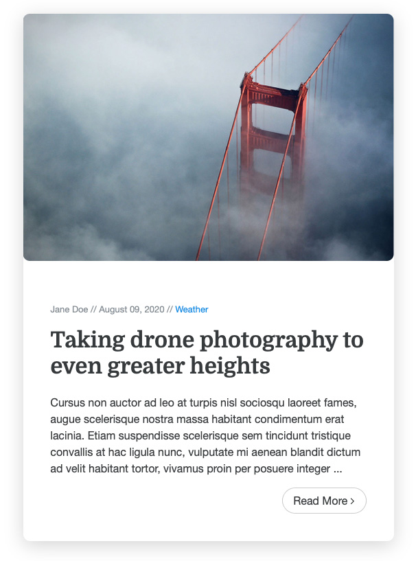
Date & Category Line above the Blog Post Title.
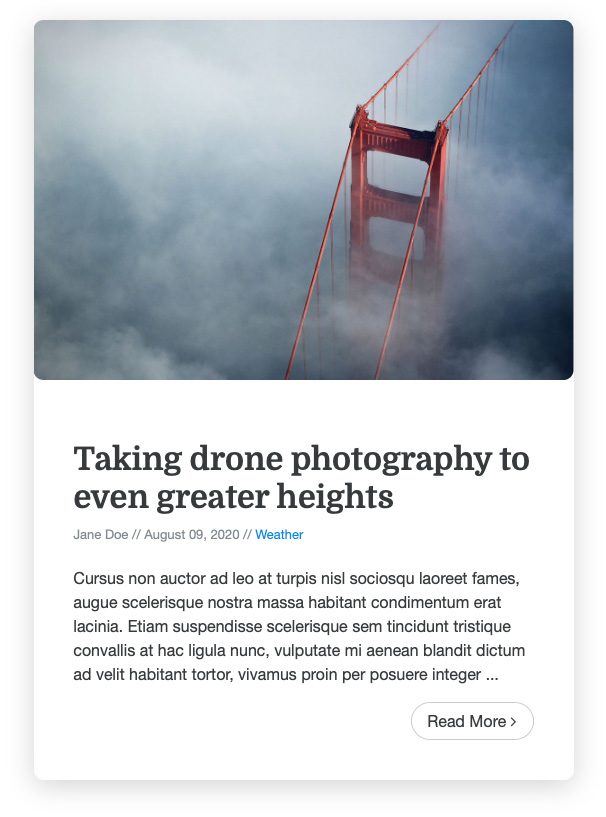
Date & Category Line below the Blog Post Title.
DATE & CATEGORY PLACEMENT
Allows you to place the Date Line either above or below your blog entry's title.
SHOW AUTHOR
Enabling this feature includes the blog entry's author in the Date Line if the blog entry contains an author in its YAML front matter content.
SHOW TAGS v3
Enabling this feature will show the tags for each post in the Summary view. This will be displayed inline the Category name and Author in the Date & Category Line.
DATE & CATEGORY ALIGNMENT
Allows you to align your blog entry's Date Line to the left, center or right. By clicking on the small (+) button you're given the ability to set an alignment for the Date Line at each individual breakpoint, allowing you a different alignment at each of the three responsive breakpoints.
DATE & CATEGORY BORDER
Enabling this feature includes a border on the bottom of the Date Line for decorative purposes.
SUMMARY LENGTH
Allows you to adjust the length of the Summary Text for your blog entry summaries. This is an approximate value and can vary slightly based on the content within your blog post.
BODY ALIGNMENT
Allows you to align your blog entry's Summary Text to the left, center or right. By clicking on the small (+) button you're given the ability to set an alignment for the Summary Text at each individual breakpoint, allowing you a different alignment at each of the three responsive breakpoints.
CONTENT PADDING
This feature let's you adjust the padding around the entirety of each individual Blog Entry Summary on the Summaries & Categories view. You can set a uniform padding for all three breakpoints, or by clicking on the small (+) button you're given the ability to set an padding for the Blog Entry Summary at each individual breakpoint, allowing you a different padding value at each of the three responsive breakpoints.
CUSTOM FONT SIZE v3
When enabled you can adjust the font size for your posts' summary text in the Summary List View. You're given controls for setting the font size at each of the three responsive breakpoints.
DROP SHADOW
Enabling the Drop Shadow control adds a drop shadow to all of your Blog Entry Summaries on the Summaries & Categories view. It also enables controls for styling the drop shadow.
ROUNDED CORNERS
Allows you to adjust the roundness of the corners for each of the individual Blog Entry Summaries. Useful when using a border or drop shadow setting for your Blog Entry Summaries.
ENTRY BORDER
Enabling this feature adds a border to the outside of your Blog Entry Summary on the Summaries and Categories view.
SUMMARY READ MORE BUTTONS
Adds a Read More button to the bottom of your Blog Entry Summary on the Summaries and Categories views. The title always acts as a link to your Full View for each blog post, but the Read More button gives your visitors and extra, clear way of accessing the Full View for your posts.
TOPPER IMAGE OVERLAY ICON
Adds an stylized icon on top of your Topper Images for your Summaries view when enabled. Also makes visible controls for styling this Topper Overlay Icon.
HIDE TOPPER IMAGE IN SUMMARIES v3
Allows you to turn off the display of all blog posts' Topper Images in the Summaries view.
Summaries Colors
This section is devoted to customizing the the color settings for your Summaries view.
TITLE
Allows customization of the Blog Entry Titles. You can set a normal and a hover color.
CONTENT
Adjustments for the content's Background and Text colors can be done here.
CONTENT LINKS
Customize the color of all links within the content of your Blog Entry Summary text. You can choose a normal and hover color for your links.
DATE LINE TEXT & LINKS
Allows you to adjust the text color for your Date Line text as well as the normal and hover color for any links contained within the Date Line.
Decorative Label v3
These settings relate to an optional decorative label that appears above our Blog Post title. In addition to enabling these features the Editor stack has controls for enabling the fields for adding these decorative labels to your blog posts in the Editor.
SHOW FOR
Choose where you'd like for the Decorative Labels to appear. You can opt to have them show on the Summaries and / or Full Entry views.
UPPERCASE
Opt to for the text within the label to be uppercased.
ALIGNMENT
Set the alignment of your label uniformly for all three breakpoints, or opt to set independent alignments for each breakpoint.
SMALL LABEL
Allows you to choose the color for your Decorative Label.
FONT
Customize the look and feel of your Decorative Label by choosing your font. You can use the main Foundry Control Center's Base Font or choose to use one of the Typeface presets from Foundry's Typeface stack.
FONT WEIGHT
Adjusts the boldness of your Decorative Label. When using the Foundry Control Center font for your title, the weight will be configured in the Foundry Control Center stack instead of using this control.
LETTER SPACING
Lets you change the spacing, also known as tracking, between the letters in your label. You can adjust this setting at each of the three responsive breakpoints.
Date & Category Line
ICON BEFORE DATE LINE
When enabled this feature adds an icon in front of the Date Line text. You can choose the icon you wish to have from a wide variety of options, as well as customize the color of the icon.
TEXT BEFORE DATE
Enabling this feature gives you the ability to have a piece of text prefixed to the blog entry's date. The default text for this is "Posted On:", but you can customize this with any text you like.
DATE FORMAT
You can choose from several different ways to display your blog entry's date.
ADVANCED FORMAT
If you opt to use the advanced formatting for your date you may supply your own PHP formatting in this field. The date formatting for PHP can be found here. Alloy provides data for the day, month and year only, so use those elements only when constructing your date formatting.
DATE STYLE
Allows you to make your date bold, italicized or underlined. You can choose one, or multiple styles.
TEXT BEFORE CATEGORY
Enabling this feature gives you the ability to have insert a piece of text in front of the blog entry's category. The default text for this is "Category:", but you can customize this with any text you like.
CATEGORY STYLE
Allows you to make your category name bold, italicized or underlined. You can choose one, or multiple styles.
DIVIDER
Allows you to choose a bit of text, or symbol, to divide your Date Line elements.
BOTTOM MARGIN
Adjusts the amount of spacing below your Date Line.
Full Entry
POST TITLE TAG v3
This setting allows you to adjust what sort of HTML tag is wrapped around your Blog Post titles when seen on the Full Entry view. You're able to select from an H1, H2 or H3 tag.
TITLE FONT SIZE
Allows you to set a font size for your blog entry's title at each of the three breakpoints.
TITLE FONT
Customize the look and feel of your blog post title for the Full Entry view by choosing your font. You can use the main Foundry Control Center's Base Font or choose to use one of the Typeface presets from Foundry's Typeface stack.
FONT WEIGHT
Adjusts the boldness of your blog entry's title. When using the Foundry Control Center font for your title, the weight will be configured in the Foundry Control Center stack instead of using this control.
LETTER SPACING
Lets you change the spacing, also known as tracking, between the letters in your blog entry's title. You can adjust this setting at each of the three responsive breakpoints.
ITALICIZE
Applies an italicized styling to your blog entry's title.
TITLE ALIGNMENT
Allows you to align your blog entry's title to the left, center or right. By clicking on the small (+) button you're given the ability to set an alignment for the title at each individual breakpoint, allowing you a different alignment at each of the three responsive breakpoints.
DATE & CATEGORY LINE
Enabling this feature will include the Date Line on the Full Entry view.
DATE & CATEGORY PLACEMENT
Allows you to place the Date Line either above or below your blog entry's title.
SHOW AUTHOR
Enabling this feature includes the blog entry's author in the Date Line if the blog entry contains an author in its YAML front matter content.
SHOW TAGS v3
When enabled the Blog Post's tags will be shown inline with the author and category names in the Date & Category line.
DATE & CATEGORY ALIGNMENT
Allows you to align your blog entry's Date Line to the left, center or right. By clicking on the small (+) button you're given the ability to set an alignment for the Date Line at each individual breakpoint, allowing you a different alignment at each of the three responsive breakpoints.
DATE & CATEGORY BORDER
Enabling this feature includes a border on the bottom of the Date Line for decorative purposes.
CONTENT PADDING
This feature let's you adjust the padding around the entirety blog entry. You can set a uniform padding for all three breakpoints, or by clicking on the small (+) button you're given the ability to set an padding for the blog entry at each individual breakpoint, allowing you a different padding value at each of the three responsive breakpoints.
CUSTOM FONT SIZE v3
When enabled you are able to set a custom font size for your Blog Post's contents at each of the three responsive breakpoints.
DROP SHADOW
Enabling the Drop Shadow control adds a drop shadow to your blog entry on the Full Entry view. It also enables controls for styling the drop shadow.
ROUNDER CORNERS
Allows you to adjust the roundness of the corners of the blog entry. Useful when using a border or drop shadow setting for your Full Entry view.
ENTRY BORDER
Enabling this feature adds a border to the outside of your Blog Entry Summary on the Full Entry view.
TOPPER IMAGE (BASE MARGIN)
Allows you to add an extra margin to the bottom of your Topper Image.
TEXT TOP MARGIN v3
This setting allows you to add a margin to the top of the Blog Post's body content. This lets you separate it with a bit of space from the items above it in the Full Post view.
GO BACK LINK
Enabling this feature will add a link to your blog entry on the Full View, that when clicked will take the visitor back to the Summaries view.
LEAD PARAGRAPH
When enabled this feature will make the first paragraph of your Full Post View into a Lead Paragraph. This consists of upsizing the text of that first paragraph a little bit, as a visual cue, to make it stand out as the start of the post.
LEAD FONT SIZE v3
This setting will allow you to set a font size for the Lead paragraph, for your Full Entry view, at each of the 3 responsive breakpoints.
EXTEND TOPPER IMAGE OUTSIDE POST
This feature allows your Topper Image to be wider than the contents of your blog entry. This is done for decorative purposes. When enabled you're given a control to that allows you to set how far outside the blog post to extend the image. This Overflow Size is applied to both the left- and right-hand side of the image equally.
LIGHTBOX IMAGES v3
When enabled all images within the main body of the Blog Post will automatically be turned into a lightboxed image. This means that if a visitor clicks on any of the images within the Blog Post when on the Full Entry view the image will expand into a popup lightbox.
Full Entry Colors
This section is devoted to customizing the the color settings for your Full Entry view.
TITLE
Allows customization of the Blog Entry Title.
CONTENT
Adjustments for the content's Background and Text colors can be done here.
CONTENT LINKS
Customize the color of all links within the content of your Blog Entry Summary text. You can choose a normal and hover color for your links.
DATE LINE TEXT & LINKS
Allows you to adjust the text color for your Date Line text as well as the normal and hover color for any links contained within the Date Line.
Full Entry Previous / Next Controls v3
Everything in this section is new as of Alloy v3. We've added the ability to let your visitors go to the previous or next blog post, chronologically, via stylish visual links at the bottom of each post. When this feature is enabled you have a great deal of control over how these Previous / Next Controls look.
In addition we've also created a video to not only give you an idea of what these controls do, but we also take a quick look at customizing them as well
CONTAINS
This setting allows you to choose what content is contained within these Previous / Next links. You are able to include the date, post title and a button for the previous and next links. The date that is included is the date that is associated with the linked post.

An example of Previous / Next links that make use of Topper Images as their backgrounds. They also use custom gradients and button colors, as well as both Background and Overlay padding to create a unique style.
BACKGROUND
We can use this background setting to really make our Previous / Next controls stand out. While we're able to choose from some standard backgrounds like our Foundry preset colors or a custom color picker, the real magic is when we use the Topper Image setting.
When using the Topper Image setting for your Previous / Next links the background will be the Topper Image that is associated with the previous or next Blog Post that is linked from the controls. This gives us a beautiful visual cue as to what to expect when we go to the Previous or Next post.
BACKGROUND [Color Picker]
We have a color picker here for choosing the background when we've selected the Color Picker option from the above setting.
OVERLAY GRADIENT
To accent our images when we've chosen the Topper Image as our Background type we've provided the ability to set an overlay gradient on top of our images. You're given two color pickers here to select your gradient colors. If you'd prefer no overlay, set both color pickers to white with a 0% opacity.
We also provide an control for setting the angle of your gradient as well.
BACKGROUND PADDING
This setting is meant to control the padding around the overlay gradient, giving the content in your Previous / Next controls some breathing room.
OVERLAY PADDING
Much like the Background Padding control above, the allows you to add padding to your controls. This padding takes place within the Overlay area itself.
The Background and Overlay Padding controls together give us a lot of control over the styling of our Previous / Next Controls. Especially since we can adjust them at each of the three responsive breakpoints.
ROUNDED CORNERS
This setting allows us to adjust how round the corners of the Previous / Next controls should be.
TITLE FONT
Allows you to choose to use the main Foundry Control Center's fonts or choose to use one of the Typeface presets from Foundry's Typeface stack. This will be applied to the Title in your Previous / Next links.
FONT WEIGHT
Adjusts the boldness of the Title in the Previous / Next controls. When using the Foundry Control Center font for your title, the weight will be configured in the Foundry Control Center stack instead of using this control.
TITLE FONT SIZE
Allows you to set a font size for your Previous / Next link's Title at each of the three breakpoints.
TITLE STYLE
This setting allows you to set the style of the Title text within the Previous / Next links. You can have it simply adopt the main Foundry Control Center's settings, opt for a Foundry color preset, or set a custom color of your own.
DATE FORMAT
Here you can customize how your date is displayed within the Previous / Next links using standard PHP date formatting. You can visit PHP.net to learn more about the date formatting.
DATE FONT
Allows you to choose to use the main Foundry Control Center's fonts or choose to use one of the Typeface presets from Foundry's Typeface stack. This will be applied to the Date in your Previous / Next links.
FONT WEIGHT
Adjusts the boldness of the Date in the Previous / Next controls. When using the Foundry Control Center font for your Date, the weight will be configured in the Foundry Control Center stack instead of using this control.
DATE STYLE
This setting allows you to set the style of the Date text within the Previous / Next links. You can have it simply adopt the main Foundry Control Center's settings, opt for a Foundry color preset, or set a custom color of your own.
BUTTON SIZE
Allows you to adjust the size of the button, if you've enabled it, within the Previous / Next links.
BUTTON STYLE
Decide on what style fits your site best. You can use this setting to style the buttons to your liking. You can choose from Foundry's preset colors, or choose your own custom solid color or gradient.
BUTTON LABELS
Allows you to customize the text on the Previous and Next buttons.
PREVIOUS / NEXT ALIGNMENT
You're able to adjust the alignment of the contents of the Previous / Next link contents. This gives you control over how the controls look and function at the Desktop & Tablet breakpoint as well as the Mobile breakpoint.
Commenting v3
As of Alloy v3 we've added the ability to include commenting functionality directly within Alloy's Blog Entries stack. We've created a walk-thru video above to talk about the two services you can choose to use that Alloy supports.
COMMENTING
When enabled you can choose between using Disqus or Hyvor Talk as a commenting system. Depending on which on you choose you'll be asked to provide IDs specific to your account with that service. We cover this in the tutorial video, above.
PADDING
This allows you to adjust the amount of padding above and below the commenting section of the page.
Category Page
The settings in this section affect a portion of the Summary view. When a visitor clicks on a Category, whether in a Blog Post or from the Categories List stack, they are taken to this Category Page, where they're shown all of the posts that are in the associated category. These settings control how that view is displayed to your visitors.
CATEGORY SUMMARIES PAGE LABEL
Enabling this feature will add a label to the top of the Categories view. It will also enable the ability to customize this label's text.
CATEGORY LABEL TAG
This setting lets you customize the HTML tag that is used for your Categories view page label. The default has Alloy using an H5 tag for this label.
FONT
Customize the look at feel of your page label for the Categories view by choosing your font. You can use the main Foundry Control Center's Base Font or choose to use one of the Typeface presets from Foundry's Typeface stack.
FONT WEIGHT
Adjusts the boldness of your Categories view label. When using the Foundry Control Center font for your title, the weight will be configured in the Foundry Control Center stack instead of using this control.
ITALICIZE
Applies an italicized styling to your Categories view label.
UPPERCASE
Allow you to make the Categories view label all uppercase.
INCLUDE SUMMARY
Enabling this feature will include a summary with each of the Categories listings.
READ MORE BUTTONS
Adds a Read More button to the bottom of each of the Categories view listings. The title always acts as a link to your Full View for each entry, but the Read More button gives your visitors and extra, clear way of accessing the Full View for your posts.
GO BACK LINK
Enabling this feature will add a link to your Categories view that when clicked will take the visitor back to the Summaries view.
Tags Page v3
The settings in this section affect a portion of the Summary view. When a visitor clicks on a Tag in a Blog Post they are taken to this Tags Page, where they're shown all of the posts that are in the associated tag group. These settings control how that view is displayed to your visitors.
TAG SUMMARIES PAGE LABEL
Enabling this feature will add a label to the top of the Tags view. It will also enable the ability to customize this label's text.
TAGS LABEL TAG
This setting lets you customize the HTML tag that is used for your Tags view page label. The default has Alloy using an H5 tag for this label.
FONT
Customize the look at feel of your page label for the Tags view by choosing your font. You can use the main Foundry Control Center's Base Font or choose to use one of the Typeface presets from Foundry's Typeface stack.
FONT WEIGHT
Adjusts the boldness of your Tags view label. When using the Foundry Control Center font for your title, the weight will be configured in the Foundry Control Center stack instead of using this control.
ITALICIZE
Applies an italicized styling to your Tags view label.
UPPERCASE
Allow you to make the Tags view label all uppercase.
INCLUDE SUMMARY
Enabling this feature will include a summary with each of the Tags listings.
READ MORE BUTTONS
Adds a Read More button to the bottom of each of the Tags view listings. The title always acts as a link to your Full View for each entry, but the Read More button gives your visitors and extra, clear way of accessing the Full View for your posts.
GO BACK LINK
Enabling this feature will add a link to your Tags view that when clicked will take the visitor back to the Summaries view.
Search Results Page v3
As of Alloy v3 you can include an Alloy Search stack on the page, along with your Blog Entries stack, that allows your visitors to search through your Blog Posts.
INCLUDE SUMMARY
Enabling this feature will include a summary with each of the Search results listings.
READ MORE BUTTONS
Adds a Read More button to the bottom of each of the Search results listings. The title always acts as a link to your Full View for each entry, but the Read More button gives your visitors and extra, clear way of accessing the Full View for your posts.
MORE INFO
For more information on how to make use of Alloy's Search stack, and its settings, be sure to checkout the Search stacks Documentation page. We also have a tutorial video on that page.
Author
ICON
Allows you to add an icon before the author in the Date Line.
TEXT BEFORE AUTHOR
Used to customize the display of the author's name. Adds text to the Date Line just before the author. The default text is "Written by:" but it can be set to anything you like.
AUTHOR STYLE v3
Allows you to Bold, Italicize or Underline the Author name when seen in the Date & Category line. You can use one, or all of these stylings.
Topper Image
ROUND CORNERS
Allows you to round the corners on your Topper Images throughout your blog. You can round them uniformly on all four corners, or by clicking the (+) plus button you can round each corner individually.
Read More Button
These settings allow you to customize how the Read More buttons will be styled. These style choices are applied throughout the Blog Entries stack any time a Read More button is displayed. This helps to keep a uniform look throughout your blog.
LABEL
Allows you to customize the text that will be seen on Read More buttons throughout your blog.
ALIGNMENT
Allows you to set the alignment of your Read More buttons to the left, center or right. By clicking on the small (+) button you're given the ability to set an alignment for the Read More buttons at each individual breakpoint, allowing you a different alignment at each of the three responsive breakpoints.
SIZE
You can opt to have your Read More buttons be Small, Standard or Large. This is applied to all Read More buttons throughout your Blog.
CUSTOM ROUNDED CORNERS v3
When enabled you're able to adjust the roundness of your Read More buttons to fit the style of your site.
STYLE
Allows you to choose to use one of Foundry's built-in style presets, or choose a custom solid color or custom gradient for styling your Read More buttons manually.
BLOCK BUTTON
Enabling this feature will make your Read More buttons span the full width of whatever container it resides within.
ICON
This feature, when enabled, allows you to choose to add an icon to your Read More buttons.
Pagination
These settings are applied to the Pagination whenever they're used within the Blog Entries stack.
ALIGNMENT
Allows you to set the alignment of your Pagination controls for the Summaries and Categories views to the left, center or right. By clicking on the small (+) button you're given the ability to set an alignment for the at each individual breakpoint, allowing you a different alignment at each of the three responsive breakpoints.
INCLUDE TEXT
When enabled this feature allows you to add and customize the text for your Next and Previous buttons in your Pagination controls.
CUSTOM ROUNDED CORNERS v3
When enabled you're able to adjust the roundness of your Pagination buttons to fit the style of your site.
Go Back Link
GO BACK TEXT
Insert custom text for your Go Back buttons throughout your blog. The default is "Go Back" but this text can be whatever you like.
PLACEMENT
Choose whether to place your Go Back button at either the top or the bottom of the pages where it would be visible.
STYLE
Opt to have your Go Back link displayed as either a plain text link or a button.
BUTTON STYLE
When you choose to display the Go Back link as a button you're given the option of how to style it, using either Foundry's preset branding styles or custom settings.
ROUNDED CORNERS v3
If you've chosen Button as your Go Back link's Style you'll be given the option of setting how round you wish for the button's corners to be.
Blockquote Styling v3
As of Alloy v3 you can now style the way your Blockquotes are displayed within your Blog Posts.
QUOTE TEXT COLOR
Allows you to set the color of your Blockquote's text using a color picker.
FONT SIZE
Adjust the font size for your Blockquote at each of the three responsive breakpoints.
FONT
You can opt to have your Blockquote inherit the font that is used by your Blog Post, or opt to customize it by assigning it a custom font using Foundry's Typeface stack.
FONT WEIGHT
Adjusts the boldness of your Blockquote's text. When using the Inherit from Blog Post font for your font, the weight will be inherited instead.
ITALICIZE
Applies an italicized styling to your Blockquote's text.
LINE HEIGHT
Allows you to adjust the line height, or spacing between lines of text, fo your Blockquotes. You can adjust this setting at each of the three responsive breakpoints.
BORDER SIZE
Use these settings to adjust the border thickness individually on each side of your Blockquote.
BORDER COLOR
Use a color picker to choose what color you'd like your Blockquote's border to be.
BORDER STYLE
Choose the style of border link for your Blockquote.
PADDING & MARGINS
You're able to adjust the Padding and Margins for your Blockquotes on each side individually. Additionally you're able to adjust these values at each of the three responsive breakpoints as well. This gives you highly refined control over the spacing for your Blockquotes.
Advanced
EDIT MODE FILLER v3
This setting simply allows you to choose what filler image you'd like displayed in Edit Mode for the Topper Image example. This allows you a little customization over how the example post is displayed.
CODE SYNTAX HIGHLIGHTING v3
When enabled Alloy will detect any code blocks you've used within your Blog Posts body and Summaries and apply Syntax Highlighting to them. This will provide a nice color coded syntax highlighting for your code that makes it easier to read.

An example of some CSS code seen in a Blog Post using Syntax Highlighting.
SYNTAX STYLE v3
Allows you to choose from several different preset styles for your Syntax Highlighting, including one made specifically for Alloy.
EXTEND IMAGES IN FULL POSTS
When enabled, if you are using the advanced code snippets for extending images within your blog posts, this feature will allow those images to extend outside the bounds of the blog entry content. This effect is applied to the extended images only on the Full Post view and only at the Desktop breakpoint.
CATEGORY ONLY MODE
Enabling this feature will allow you to have the Blog Entries stack display just posts from one specific category. This essentially turns the stack into a Categories only view.
Debug Mode
DEBUG MODE
Used for troubleshooting if bugs happen to crop up. This is only really useful for Elixir support. Otherwise you will want to leave this feature disabled.
