Editor
Stack settings
The Editor stack will allow you to create a backend for your site. This secured backend allows you to create, modify and delete Blog Posts, Embeds and Data Droplets directly from your website. It is the hub for all of your Alloy content.
Credentials
This section, as well as the Password setup portion of the Editor's settings, are important in configuring your blog's backend. So much so that we've created a video below to get you started!
USER NAME
This is where you will configure the user name for your login. Keep it simple. This field should not contain spaces or special characters.
Please Note: Your user name, as well as your secondary login user name, should not be an email address and should not contain special characters.
HASHED PASSWORD
This is where you will paste your hashed password, which you will receive when you're using the Setup Password feature. PLEASE watch through the video above to see how this process is done. This hashed password system provides a secure method of verifying your login, keeping your password from being published to the site.
SECONDARY LOGIN
When enabled this feature allows you to configure another login with a separate user name and password. This allows you to make login credentials for a secondary user, which can be revoked by simply changing the Secondary Login information and republishing your Editor page.
2ND HASHED PASSWORD
This is where you will paste your hashed password for the secondary account, which you will receive when you're using the Setup Password feature.
Password Setup
SETUP PASSWORD
Enabling this feature and then publishing your page will put the Alloy Editor into Password Setup mode. This allows you to create a secure, hashed password. After creating your hashed password you will copy and paste it into the appropriate HASHED PASSWORD field above.
Once you've done so, disable this feature and once again republish your page. Your secure password has now been configured.
A warning message in Edit Mode will be displayed when this feature is turned on. This is simply to remind you to turn off Password Setup mode when you're done creating your Hashed Password.
Login
Alloy provides a nice login for your Editor backend. You can customize the login experience by providing custom a custom logo, custom full-page background and much more.
CUSTOM LOGO
Your user login features a logo above the User Name and Password fields. Normally it is the Alloy icon, but if you'd like you can enable this Custom Logo feature and provide your own logo. The logo must be no larger than 128 px tall. The Editor stack will scale down your image to be a max of 128 px tall. It is recommended to simply use a 128 px tall image though.
USER PLACEHOLDER
This field allows you to customize the placeholder text for the User Name field on the login screen.
PASSWORD PLACEHOLDER
This field allows you to customize the placeholder text for the Password field on the login screen.
LOGIN BUTTON LABEL
You can insert your own custom text for the Login Button text label here.
LOGIN BUTTON STYLE
Choose from one of Foundry's preset colors, or choose your own custom color, for the Login Button. When set to custom you'll be given color pickers to set the background and text colors for your button.
ROUNDNESS v3
Customize the roundness of the Login Button's corners. Setting this to somewhere around 40px will provide a nice rounded pill-shaped button.
ALIGN LOGIN BUTTON v3
Allows you to align the Login Button to the left, center or right when not using the Block Button setting. You can set it uniformly, or adjust it independently at each of the three responsive breakpoints.
BLOCK BUTTON v3
Enabling this feature will cause the Login Button to span the width of the login form.
DEFAULT VIEW v3
You can choose which content editing view you're presented with first when logging into the Editor backend. You can choose to have the Editor login to the Blog Posts, Embeds or Droplets section after successfully logging in.
Full Page Login v3
To add an even more customized look and feel to your Editor you can enable Alloy's Full Page Login feature. This creates a full page login experience that allows you to set a background and stylish boxed appearance for the login credentials.
FULL PAGE LOGIN
When enabled you'll get a full page overlay when logging into the Editor backend. This gives a nice sleek, professional feel to your Editor backend.
FULL PAGE BACKGROUND TYPE
You can choose from several different styles for the background of your full page login screen to customize its look and feel:
- Color Picker
- Gradient
- Image
- Preset Images 6
LOGIN BOX WIDTH
When in full page mode the login form is inserted into a stylish box in the center of the page. This setting allows you to adjust the width of the box at each of the three responsive breakpoints.
BOX BACKGROUND COLOR
Customize the background color of your login form box. It defaults to a nice translucent white that allows for your full page background to show through just a bit.
RELATED
Utility Menu v3
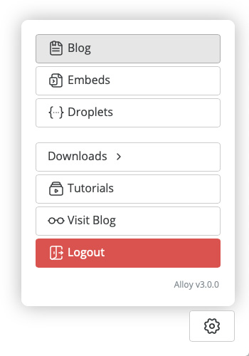
With the addition of two new content types in Alloy v3 the Utility Menu has taken on a larger role. This section allows us to customize the label names for the Utility Menu which appears in the bottom left corner of the Editor backend.
BLOG
Customize the button label that takes you to the Blog Posts section of the Editor.
EMBEDS
Customize the button label that takes you to the Embeds section of the Editor.
DROPLETS
Customize the button label that takes you to the Droplets section of the Editor.
DOWNLOAD POSTS BUTTON
Customize the button label that allows you to download your Blog Posts from your server for backup purposes.
DOWNLOAD EMBEDS BUTTON
Customize the button label that allows you to download your Embeds from your server for backup purposes.
DOWNLOAD DROPLETS BUTTON
Customize the button label that allows you to download your Droplets from your server for backup purposes.
INCLUDE TUTORIALS BUTTON
When enabled a Tutorials button will appear in the Utility Menu inside the Editor. This gives you quick access to tutorial videos about using and setting up Alloy.
TUTORIALS BUTTON
Customize the button label that takes you to the Alloy tutorials page.
VISIT BUTTON
If you've linked your Editor to the blog page on your site not only will you see View buttons within the Editor's Blog Posts List view, you'll also get a Visit Blog button in the Utility Menu. This field allows you to customize the text for the button linked to visiting your blog.
CLEAR CACHE BUTTON v3.1
If you're using Alloy's Server Side Caching feature, this toggle allows you to enable a button within the Utility Menu for manually clearing the cache, if you ever need to.
INCLUDE CLEAR CACHE BUTTON
When enabled the Clear Cache button is added to the popup Utility menu. This button allows you to manually clear the server-side cache if it ever become necessary.
CLEAR CACHE
Customize the button label for the Clear Cache button when it is enabled.
LOGOUT BUTTON LABEL
Customize the button label that allows you to logout of the Editor.
LOGOUT BUTTON STYLE
Choose from one of Foundry's preset brand styles or choose custom colors for your Logout Button.
CREDIT ALLOY
When enabled the Alloy version number is added to the bottom of the Utility Menu for reference.
List View Accent Icons v3
As an added nicety we've included icons at the top of each list view. This makes quickly distinguishing which list view you're currently on -- Blog Posts, Embeds or Droplets.

Blog Posts
Embeds

Droplets
LIST VIEW ICONS
If the List View Accent Icons aren't to your liking, or you just prefer a more minimal look, you can disable them here.
ICON SIZE
Allows you to pick a size for the List View Accent Icons that you prefer.
Posts, Embeds & Droples Lists v3
These are a few general settings that can apply to all three List views in the Editor.
Box Around List View
When enabled a box is wrapped around the List view to provide a contained looking style for the Editor's List views.
Set Page Background for Editor
This is in essence a shortcut for setting the page's background color for the Editor pages. This keeps you from needing to modify the page's background color settings in your Foundry Control Center stack.

The Editor toolbar provides quick access to Markdown formatting, and more.
Editor Toolbar
This series of toggle buttons allows you to enable and disable certain formatting buttons within the toolbar of the text editor inside of the Blog Posts and Embeds Add / Edit pages. This gives you control over how you wish for the Editor to look and function according to how you like to work.
BOLD, ITALIC & STRIKE
These are standard text formatting controls that allow you to click them to bold, italicize or strike text in your Blog Post or Embed.
HEADER
Enable this toggle button to add a Header control to the toolbar. This allows you to produce section headers within your Blog Posts and Embeds, which equate to HTML header tags.
QUOTE
Allows you to create a blockquote within your post or embed to quote another source, author, etc.
UL & OL
These two toggles allow you to add an Unordered List (UL) or an Ordered List (OL) to your toolbar. These toolbar buttons allows you to create lists within your Blog Posts and Embeds.
TABLE
Building a table can sometimes be a bit of hard work. Markdown though makes creating a table fairly easy. You can enable this toggle to add a Table creation button to your toolbar. That button will produce a quick, starter table for you to work from. A good practice when building a Markdown table is to use the side-by-side mode of the Editor to see your progress as you build your table.
IMAGE
Enabling this toggle will add a basic Markdown image button to the toolbar. This button will simply create the basic Markdown outline for you to fill in with your own URL and Alt Tag. The toolbar settings also allow you to add an Image Upload button as well, which is a bit easier for most users to make use of. You can also drag-and-drop an image into the Main Body of a Blog Post or Embed to upload an image. This works only in the Main Body field. The image will be inserted into the Main Body where your cursor is currently located.
LINK
Allows you include a link button in your toolbar. This is to set a link on a piece of text or an image. If you have not selected text or an image when clicking this button it will generate a Markdown link template for you.
CODE
Inserts a Code button into your toolbar what allows you to format content in your post to display as code.
RULE
This toggle adds a horizontal rule button to your toolbar. This horizontal rule button will add a divider line to your Blog Post or Embed content.
PREVIEW
Adds a Preview button to the toolbar which allows you to see your Markdown as fully rendered text, images, tables, etc. This can also be used in Full-Screen mode.
SIDE-BY-SIDE
This is a bit like the Preview button except you retain the ability to continue editing your content, yet see the rendered preview update as you make changes. This is especially helpful for users that are new to using Markdown. This can also be used in Full-Screen mode as well.
FULL-SCREEN
Allows you to include a button in the toolbar that will take the Editor full-screen. This helps get rid of distractions while writing. The Preview and Side-By-Side features both pair well will Full-Screen mode.
GUIDE
Enabling this feature will add a button in the toolbar which links to a comprehensive Markdown guide. This is great for users that are new to Markdown, as it provides a great reference to how Markdown is formatted and used.
UNDO / REDO v3
Choose to add an Undo and / or Redo button to the toolbar. This allows you to undo / redo changes you'd made in your content.
YOUTUBE & VIMEO
These toggles allow you to add YouTube and / or Vimeo buttons to the toolbar. These buttons prompt your for the appropriate video ID when clicked. After providing the ID the Editor will generate the appropriate video embed code for that service using your provided ID.
IMAGE UPLOAD
As mentioned earlier you can add an Image Upload button to the toolbar that allows you to upload an image directly into your Blog Post or Embed's main content. Alloy handles where to upload the video and makes sure you do not overwrite any existing images that have a similar file name. It then generates the appropriate Markdown for your image where your cursor was located.
You can also drag-and-drop an image into the Main Body of a Blog Post or Embed to upload an image. This works only in the Main Body field. Much like the button, the dragged-and-dropped image will be inserted into the Main Body where your cursor is currently located.
COMMAND SHORTCUTS
There is also a Shortcuts button that will always be included in the toolbar. This allows you to get a quick popup reference to shortcut keys that can be used while creating and editing your content in the Alloy Editor.
Posts List
This section helps us control how the list of Blog Posts will appear and function in our Editor. We can adjust the number of posts we see on each page as well as the styling of how they're displayed to us.
BLOG PAGE
Link to your blog page here. This will allow the Editor to know where your blog is located so that you can make use of the Editor's ability to view your posts right from the Posts List view. When enabled a Visit Blog button will also be added to the Utility Menu.
ADD NEW LABEL
Allows you to customize the text for the Add New Post button at the top of the Editor.
ADD BUTTON STYLE v3
Choose from one of Foundry's preset colors, or choose your own custom color, for the Add New Post Button. Beginning with Alloy v3 you can also choose to set the button to a custom gradient as well.
ADD BUTTON ICON v3
Customize the Add New Post button further by choosing an icon of your liking to accompany the label.
ALIGN ADD BUTTON v3
Choose whether to have the Add New Post button aligned to the left, center or right of the page.
ROUND CORNERS v3
Allows you to round the corners of the Add New Post button to change its aesthetic to your liking. We find a 20px border radius here makes for a nice rounded pill-shaped button.
ACTIVE POSTS
Allows you to choose how many active blog posts will be shown on each of the Posts View pages. We feel that 10 - 12 per page is usually a good amount.
DATE FORMAT
Choose from several date configurations for how you wish the Posts List to display each post's date. This affects how the date is shown in the Editor only, and does not affect the way the date is displayed to your visitors on the actual Blog Posts. The display of the dates on your visitor facing Blog Posts can be changed within the Blog Entries stack.
INVERSE LIST HEADERS
This is a purely aesthetic feature that will inverse the display of the Draft, Future and Active table headers.
HIGHLIGHT ROWS ON HOVER
Allows the rows within your Posts List view to highlight slightly when they are hovered over in the Posts List view.
BOLD POST TITLES v3
If you'd like the Blog Post titles to stand out a bit more in the Editor's List View you can enable this feature to have the titles show in a bolded font.
SHOW CATEGORY v3
Enabling this option will add the Category name for each Blog Post to their individual listings in the List View. The Category name will appear just below the Blog Post title.
SHOW TAGS v3
Enabling this option will add the Tag names for each Blog Post to their individual listings in the List View. The Tag names will appear just below the Blog Post title. If Show Category is enabled the Tags appear to the right of the Category name.
DRAFTS, FUTURE & ACTIVE LABELS
Allows you to customize the labels for the Drafts, Future and Active posts lists for the Posts List view.
LABEL SIZE v3
This setting is used to customize the size of the Drafts, Future and Active Posts labels. This allows you to set a different size for these labels at each of the three responsive breakpoints.
LABEL COLOR v3
Allows you to customize the color of the Drafts, Future and Active Posts labels.
Add / Edit Post
Here we can customize how the Add / Edit view for Blog Posts looks and functions. This is the view you'll see when you are adding a new Blog Post or making edits to an existing post.
SPELL CHECKER
The Editor stack has a simple spell checker for the text field where you write the main body of your blog posts. This option allows you to toggle that setting on or off.
NEW POSTS START AS DRAFTS v3
When enabled this setting starts each new post as a draft. This ensures that you do not accidentally save a post as an active post before you're ready for it to go live.
NEW POST: AUTOFOCUS TITLE FIELD v3
Enabling the autofocus features allows you to begin writing quickly when starting a new post. Your cursor will begin a new post located directly in the Title field without having to click there to get started.
SMALL DECORATIVE LABEL v3
This feature allows you to adorn your blog posts with a small decorative label above your Blog Post titles for the Summary and / or Full Entry views. Checking this box will add the appropriate fields to the Editor for this feature. The Blog Entries stack contains the controls for styling this small decorative label on the Blog page itself.
CUSTOM SUMMARY FIELD v3
When enabled you'll be given an additional editor field when creating and editing Blog Posts. This field will allow you to write a custom Summary for each individual post. This custom Summary will be seen on the Blog's Summary View. If left blank the Summary will continue to be a truncated version of the start of your Blog Post.
Some things to note:
- It is generally a good idea to still keep your Blog Post summaries to the point.
- To keep a nice looking layout you'll want to write all of your summaries to be realtively the same size.
- If you write custom summaires for posts, but later disable this feature, those custom summaries still exist in the individual posts and will be used by the blog.
FIELD HEIGHTS v3
Use these two settings to adjust the height of the Custom Summary and Main Body fields of the Blog Post editor. Generally you do not need as much room for the Custom Summary field as you do for the Main Body of your Blog Posts.
Add / Edit Post Localization
Here we can configure how labels, placeholders, button text and more appears when adding and maintaining our Blog Posts. This allows for customization of the interface and localization into your native language.
POST TITLE
Allows you to customize the placeholder text for the Blog Post Title field.
SUMMARY v3
Placeholder text that will be inserted into the Custom Summary field if you have it enabled.
MAIN CONTENT
This is the placeholder text that will appear in your Blog Post's main body content field.
TOPPER LABEL
The is the label text that is located above the Topper Image in the add / edit view for Blog Posts.
TOPPER BUTTON v3
This field allows you to configure the text found in the Topper Image upload button found below the Topper Image.
TOPPER IMAGE ALT TAG
This is the placeholder text that will be inserted into the Alt Tag field for your Topper Image.
DATE LABEL
Contains the text that will appear above the Date picker field.
AUTHOR LABEL
This text will appear above the Author field.
AUTHOR
This is the placeholder text that will be seen inside of the Author field.
CATEGORY LABEL
This is the text that will appear above the Category field.
CATEGORY
This is the placeholder text that will be seen inside of the Category field.
TAGS LABEL v3
This is the text that will appear above the Tags field.
TAGS v3
This is the placeholder text that will be seen inside of the Tags field.
DRAFT & PUBLISHED LABELS v3
These two fields allows you to customize the text that makes up the Draft button's labels to indicate whether the post is currently a draft post or whether it has been published and is live.
CANCEL & SAVE BUTTONS
Let's you customize the labels for the buttons that Cancel your post editing or Save your post's progress.
Markdown Embeds v3
Markdown Embeds allows us to embed a small stack in our RapidWeaver page that can then be edited directly from our Editor backend on our site. This makes changes to content a breeze and means not needing to republish pages to make minor corrections in some of our content.
Here in this section, and the following Markdown Embeds Localization & Style section, we can customize how the Editor displays our Embeds List view and Embeds editor screens.
We talk more about how to use Embeds with our RapidWeaver sites in the tutorial videos included on the Editor's Content Management documentation pages.
EMBEDS FOLDER
This is where we name the folder which will contain all of our Markdown Embeds. Generally there is no need to rename this folder. It will not be seen by your visitors.
Also, do not leave this field blank. Be sure that your folder name does not contain spaces or other non-standard characters. A good substitute for spaces is a dash or underscore if necessary.
The first time you visit your Editor page it will check to see if this folder exist yet or not. If it does not Alloy will create it for you and populate it with an example Embed.
FIELD HEIGHT
Use this control to adjust the height of the Main Body field of the Embed editor. This will allow you to give yourself the amount of room you require for writing the content for your Embeds.
BOLD EMBED TITLES
If you'd like the Embed titles to stand out a bit more in the Editor's List View you can enable this feature to have the titles show in a bolded font.
SPELL CHECKER
Allows you to toggle the spellchecker for the Main Body of the Embed editor on and off, depending on your particular needs.
Markdown Embeds Localization & Styling v3
EMBEDS SECTION
This text will appear at the top of the Embeds List View to signify which section of the Editor you're currently viewing.
ADD EMBED BUTTON
Allows you to customize the text for the Add New Embed button at the top of the Editor.
ADD BUTTON STYLE
Choose from one of Foundry's preset colors, or choose your own custom color or a custom gradient, for the Add New Embed Button.
ADD BUTTON ICON
Customize the Add New Embed button further by choosing an icon of your liking to accompany the label.
ALIGN ADD BUTTON
Choose whether to have the Add New Embed button aligned to the left, center or right of the page.
ROUND CORNERS
Allows you to round the corners of the Add New Embed button to change its aesthetic to your liking. We find a 20px border radius here makes for a nice rounded pill-shaped button.
TITLE
This text appears in the label above the Embed's Title field.
TITLE PLACEHOLDER
This is the text that will populated the Title field for the Embed form.
FILENAME
This is the text that will appear above the Filename field when editing an existing Embed.
WARNING MESSAGE
This is the text that will appear below the Filename field if you Unlock the Filename field to edit it. This warning tells the user that is they change the filename it will break any existing links to Embeds they've already placed on their RapidWeaver page(s).
CONTENT
This is the label that appears above the Embed editor's Main Body field.
NEW PAGE
This is the text that will appear in the Page drop down selector. The New Page option allows the user to create a new Page name for the drop down selector.
PLACEHOLDER
This is the placeholder text that will populate the field for the New Page name when the user has selected New Page from the Page drop down list.
CANCEL & SAVE BUTTONS
Let's you customize the labels for the buttons that Cancel your post editing or Save your Embed's progress.
Droplets v3
Alloy's Droplets allow us to insert editable content into special places within our RapidWeaver content. When we put Droplet tags into our project file and publish it we can then make changes to that Droplet from then on out right from the Editor without needing to deal with our project file.
For instance we can make a Droplet to insert into a Foundry Image stack and then have the ability to change that image directly from our site at the drop of a hat. We can insert Droplets into Headers, Buttons, Lists, and so much more. Heck, you could even insert Droplets into Blog Posts and Embeds as well.
We talk more about how to use Droplets on our site in the tutorial videos included on the Editor's Content Management documentation pages.
DROPLETS FOLDER
This is where we will name the folder which will contain all of our Droplet files. Generally there is no need to rename this folder. It will not be seen by your visitors.
Also, do not leave this field blank. Be sure that your folder name does not contain spaces or other non-standard characters. A good substitute for spaces is a dash or underscore if necessary.
The first time you visit your Editor page it will check to see if this folder exist yet or not. If it does not Alloy will create it for you and populate it with an example Droplet.
Droplets Localization & Styling v3
DROPLETS SECTION
This text will appear at the top of the Droplets List View to signify which section of the Editor you're currently viewing.
ADD DROPLET BUTTON
Allows you to customize the text for the Add New Droplet button at the top of the Editor.
ADD BUTTON STYLE
Choose from one of Foundry's preset colors, or choose your own custom color or a custom gradient, for the Add New Droplet Button.
ADD BUTTON ICON
Customize the Add New Droplet button further by choosing an icon of your liking to accompany the label.
ALIGN ADD BUTTON
Choose whether to have the Add New Droplet button aligned to the left, center or right of the page.
ROUND CORNERS
Allows you to round the corners of the Add New Droplet button to change its aesthetic to your liking. We find a 20px border radius here makes for a nice rounded pill-shaped button.
TITLE
This text appears in the label above the Droplet's Title field.
TITLE PLACEHOLDER
This is the text that will populate the Title field for the Droplet form.
TAG
This is the text that will appear above the Tag field when editing an existing Embed.
TAG PLACEHOLDER
This is the text that will populate the Tag field for the Droplet form.
WARNING MESSAGE
This is the text that will appear below the Tag field if you Unlock the Tag field to edit it. This warning tells the user that if they change the Tag it will break any existing links to Droplets they've already placed in their RapidWeaver project file.
TYPE
This text appears in the label above the Droplet's Type field.
TEXT TYPE
This is some of the text that will populate the Type drop down when adding a new Droplet.
IMAGE TYPE
This is some of the text that will populate the Type drop down when adding a new Droplet.
PAGE
This is the text that will appear above the Page drop down selector.
NEW PAGE
This is the text that will appear in the Page drop down selector. The New Page option allows the user to create a new Page name for the drop down selector.
NEW PAGE
This is the placeholder text that will populate the field for the New Page name when the user has selected New Page from the Page drop down list.
DATA LABEL
This field allows you to provide a customized label that will appear over the data field when editing an existing Droplet.
NOTES LABEL
This is the text that will appear over the Notes field.
PLACEHOLDER
This is the placeholder text that will populate the Notes field.
CANCEL & SAVE BUTTONS
Let's you customize the labels for the buttons that Cancel your post editing or Save your Embed's progress.
UPLOAD IMAGE
This is the text that will appear on the Upload Image button when a Droplet is of the Image type.
Example Posts List
COLLAPSE EXAMPLE IN EDIT MODE
Allows you to hide the example Posts List view in edit mode.
Advanced
SESSION EXPIRATION
When logging into the Editor via your website, we want to make sure that after some period of inactivity that you, the user will be logged out. This setting allows you to choose the length of time, after there is no activity, that the system will log you out. The default Session Expiration period is 1440 seconds (24 minutes). The maximum value you can choose is 43,200 seconds (12 hours) and the minimum value is 600 seconds (10 minutes). For most use cases the default of 1440 seconds should suffice.
TRANSLITERATE FILENAMES
This should only be enabled in the event you're using a non-Latin based language for your Blog Post titles and having problems with your blog. This a very niche, corner case feature. Most users will never need this feature.
AUTO SAVE v3
This feature will enable Auto Save for the Blog Posts editor. This feature only works when editing an existing Blog Posts.
This feature saves the current blog post's Main Body content every so often. It does not write this saved information to file, but stores it locally in your browser. This way if you accidentally close a blog post or get logged out automatically after a period of inactivity, your blog post content will be accessible when you return to editing the post again.
DELAY v3
This is the time between auto saves. It defaults to 30,000ms, or approximately 30 seconds.
Debug Mode
DEBUG MODE
Used for troubleshooting if bugs happen to crop up. This is only really useful for Elixir support. Otherwise you will want to leave this feature disabled.
Shortcut keys
Below you'll find a list of shortcut keys that can be used when editing the Main Body of a Blog Post or Embed. These shortcuts can also be accessed from the toolbar as well.
When adding and editing posts you can, as always, continue to use Markdown for the main body content of your blog posts. The Alloy Editor though takes things to the next level with both its toolbar (see above) that inserts Markdown code as well as its keyboard shortcuts. Below is a full list of all available keyboard shortcuts when writing in the main body content area of your blog posts:
cmd-' : Blockquote
cmd-b : Bold
cmd-i : Italicize
cmd-option-s : Strikethrough
cmd-, : Increase Heading Size
cmd-. : Decrease Heading Size
cmd-k : Insert Link
cmd-option-i : Insert Image
cmd-option-; : Insert Unordered List
cmd-option-l : Insert Ordered List
cmd-option-h : Insert Horizontal Rule
cmd-option-c : Insert Code Block
cmd-option-t : Insert Table
cmd-p : Preview
cmd-option-f : Full Screen
cmd-option-p : Side-By-Side View
